Colour plays a significant role in the lives of most people. Different colours have different effects, and some can be used to change our mood, evoke deep emotions, and influence the decisions we make.
Colour is one of the most important elements of website design. Not only can it make a website more visually appealing, but it will also have an effect on how users interact with the site. Your customer experience is what determines how they feel about your brand, and it can be detrimental to their impression if something is wrong.
In this fast-paced, ever-changing world, it has become imperative that brands find new ways to connect with their customers and engage them. One way is through the use of colour. Brands are tapping into the emotional triggers associated with colours to evoke certain feelings in their customers.
A study published in the Journal of Experimental Psychology: Applied found that people are more likely to purchase items when the colour of these items is vivid, which explains the popularity of high-visibility products in many retail outlets.
Studies have also found that colours in the green family, such as light green or yellow, provide a sense of tranquillity and relaxation to customers. On the other hand, red provides the perfect environment for excitement and passion. So if you want to create an environment that would be appealing to your target demographic, think about what mood they would want to be in when viewing your site.
Below are some examples of commonly used colours and what they can signify to a customer.
Red is one of the most powerful colours in the spectrum. It is seen as a symbol of danger, love, and anger. Red can be used to grab your audience's attention but you should try not to overuse it. Red is most effective for film, fashion and sport.
One brand which uses a lot of reds is Nike. In the past, they often paired red with black to create a sense of both power and elegance. Today, they use red on its own as a primary branding colour in their logos and marketing campaigns.

Blue is the colour of trust, honesty and wisdom. Blue also carries a calming effect and is often a symbol of hope and tranquillity. Due to its associations, blue is most commonly used within the medical industry for dental and healthcare services.
One example of a company that incorporates the colour blue prominently in its branding is IBM. IBM employs the use of blue in many aspects of their company, from their logo to their website, as well as on various product packaging. The use of the colour blue is no coincidence; studies have shown that people are drawn to blue due to its calming and soothing properties.
The colour green is often associated with feelings of security, tranquillity, and peace. It can also have a calming effect on the body and emotions. Green is said to help promote positive thoughts and feelings. Green is a perfect colour for natural or health products, environmental products or services and food.
One company that has been known to use the colour green is Starbucks with their iconic mermaid logo. As one of the most well-known chains in the world, they are often commended for using a striking green to represent their brand.
Orange is an upbeat and energising colour. It's often associated with being creative or confident because of its association with the sun. The colour is commonly used for physical challenges, fitness and children’s activities.
The Nickelodeon brand is one of the oldest and most well-recognised in the world. With their iconic orange logo, they have been at the forefront of kids entertainment since day one, pioneering new methods to stay relevant with a changing audience.
Black is an elegant colour which can be associated with a variety of different feelings and emotions such as luxury, power and mystery. The colour black is most commonly associated with luxury products, fashion and film.
Adidas is a company that utilises the colour black prominently in its branding. The Adidas logo, which is found on their products and clothing, is in the shape of three parallel stripes. The black stripe stands for Adidas' ambition to be the best sports brand and innovator.
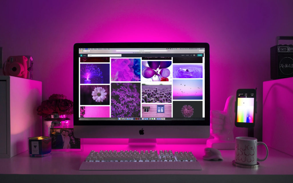
The colour purple has many different meanings and feelings associated with it. The deep, rich colour is often associated with royalty and wealth and can also be interpreted as being the colour of compassion.
One example of a company that incorporates the colour purple in its branding is Cadbury, one of the most iconic chocolate companies in the world. The colour purple was chosen because it conveys elegance, luxury, creativity and intelligence.
In summary, the use of colour on the web is an important aspect of design. By being aware of how colours are perceived by readers and paying attention to contrast and readability, a designer can choose a palette that will create the best user experience.